
Avoid These 6 UI Mistakes to Captivate Users in 2024
 Read Time: 8 minutes
User interfaces (UI) shape how people interact with technology, creating either a positive or negative overall user experience. While the digital landscape is ever-changing, certain design principles are evergreen—and for good reason. These 6 principles are part of the backbone of crafting intuitive and seamless digital experiences.
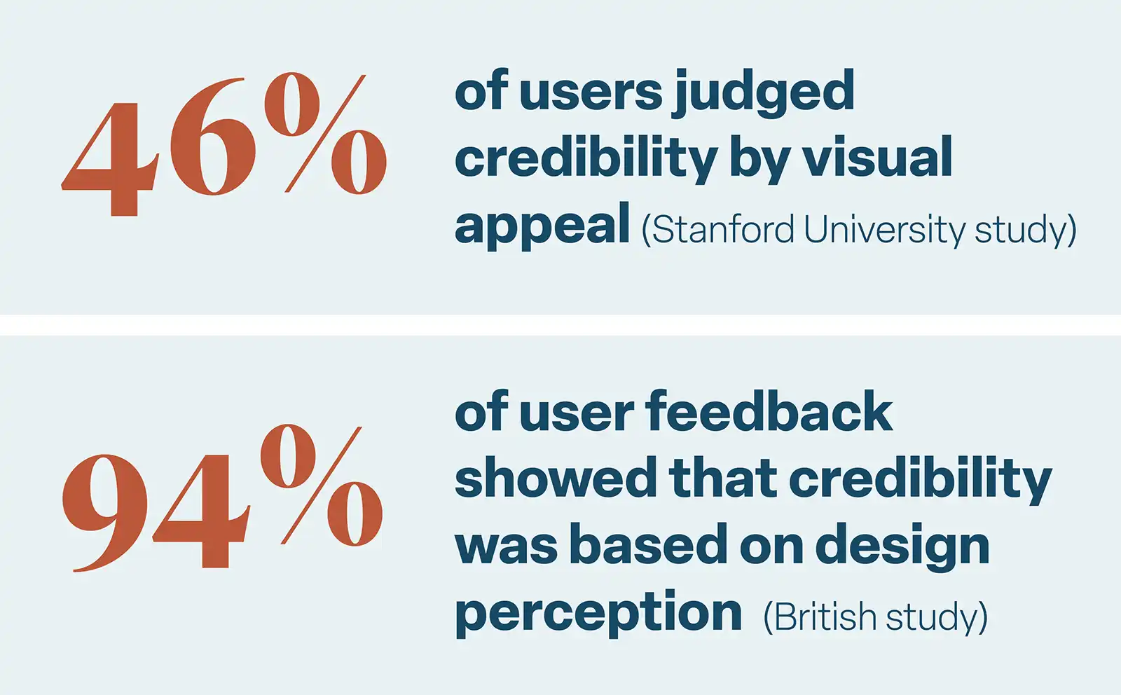
Some creators of software view the visual design of their system as a low priority. However, a study conducted by Stanford University found that users often prioritize aesthetics over content when forming initial impressions. Nearly half of the participants (46%) judged website credibility based on visual appeal, considering factors like layout, fonts, and colors.
Additionally, a British study analyzed participant feedback on website credibility, finding that 94% was related to design perception, while only 6% stemmed from the actual content. In other words, design is nearly 16 times more important than content for building website trust.
A comprehensive article by CXL delves deeper into the power of first impressions in the digital world. And while many of these statistics focus on websites, the same principles can be applied to custom software systems.
This isn’t to say that content should take a back seat to visual presentation, nor is it to say that your software’s design must be a work of artistic beauty. However, if your software’s first impression doesn’t captivate the user within seconds, your valuable content may never be consumed.
So how can you improve the first (and lasting) impression of your software? Here are 6 mistakes many designers make and the ways you can avoid making them.
Low conversion rates? Clarify confusing CTAs.
Calls-to-Action (or CTAs) are elements within a design—typically in the form of buttons, links, or prompts—that encourage users to take a specific action. They are essential in guiding users through a website or application, helping them easily understand what steps to take next and facilitating a seamless and purposeful user experience.
When CTAs are missing or unclear, users can get lost and eventually bounce from a page without performing the intended action. Alternatively, if there are too many CTAs, the user can become overwhelmed, not knowing which action is the most important. This naturally leads to fewer conversions, whether those are purchases, subscriptions, signups, or account creations.
In a system UI, it's vital to visually differentiate between primary and secondary CTAs. To achieve this, ask yourself these key questions: Which action aligns best with the primary goal of the page? What action is essential for fulfilling the user's main purpose on this page?
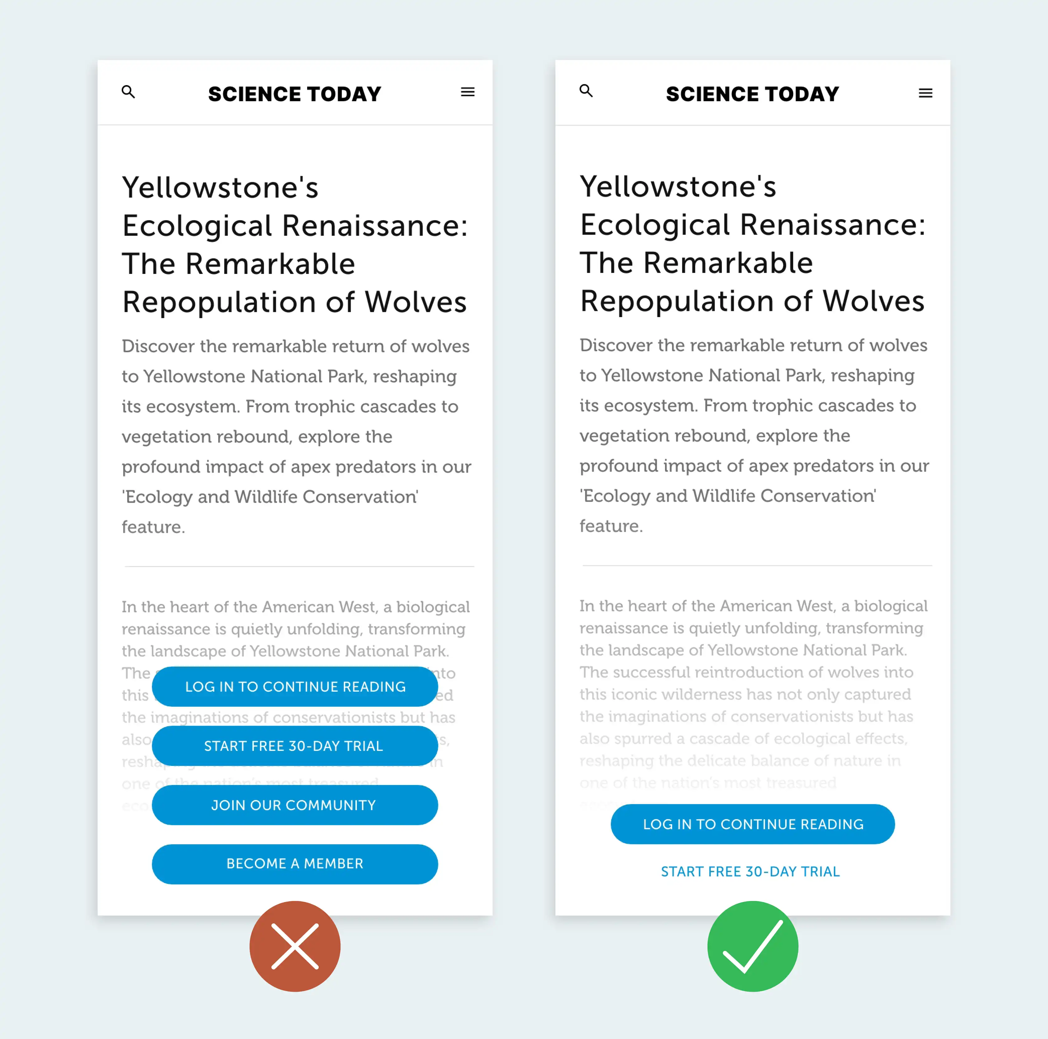
Avoid: Overwhelming users with stacked CTAs in close proximity that all look visually similar.
Best Practice: Limit the primary CTA to one main action per page. Help the user focus on that primary action by visually de-emphasizing or moving all other actions.
Poor readability? Create hierarchy in the text.
Establishing a clear text hierarchy in your UI is vital for enhancing user comprehension. When text lacks hierarchy, users may miss essential information. In many cases, this can cause user frustration, decreased engagement, and impaired decision-making.
To increase usability, organize content with larger fonts for key information and smaller fonts for details. Maintain visual cohesion by using consistent font styles and colors for headers and body text. This simple adjustment ensures a smooth reading experience, minimizing the risk of users missing crucial information.
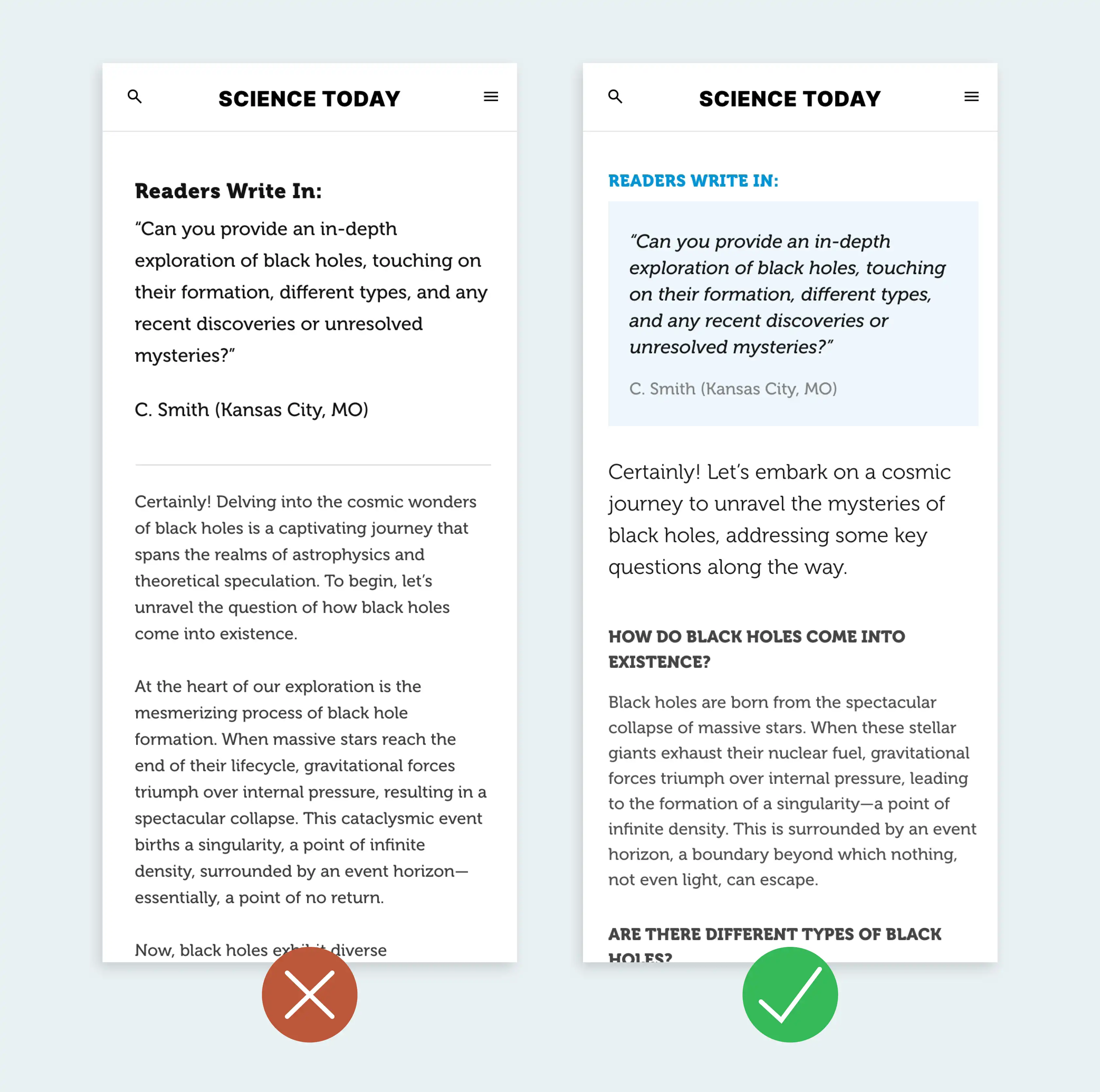
Avoid: Uniform text styles and overemphasizing non-essential elements.
Best practice: Vary font sizes, colors, and styles in a meaningful way. Ensure contrasting elements to highlight important information.
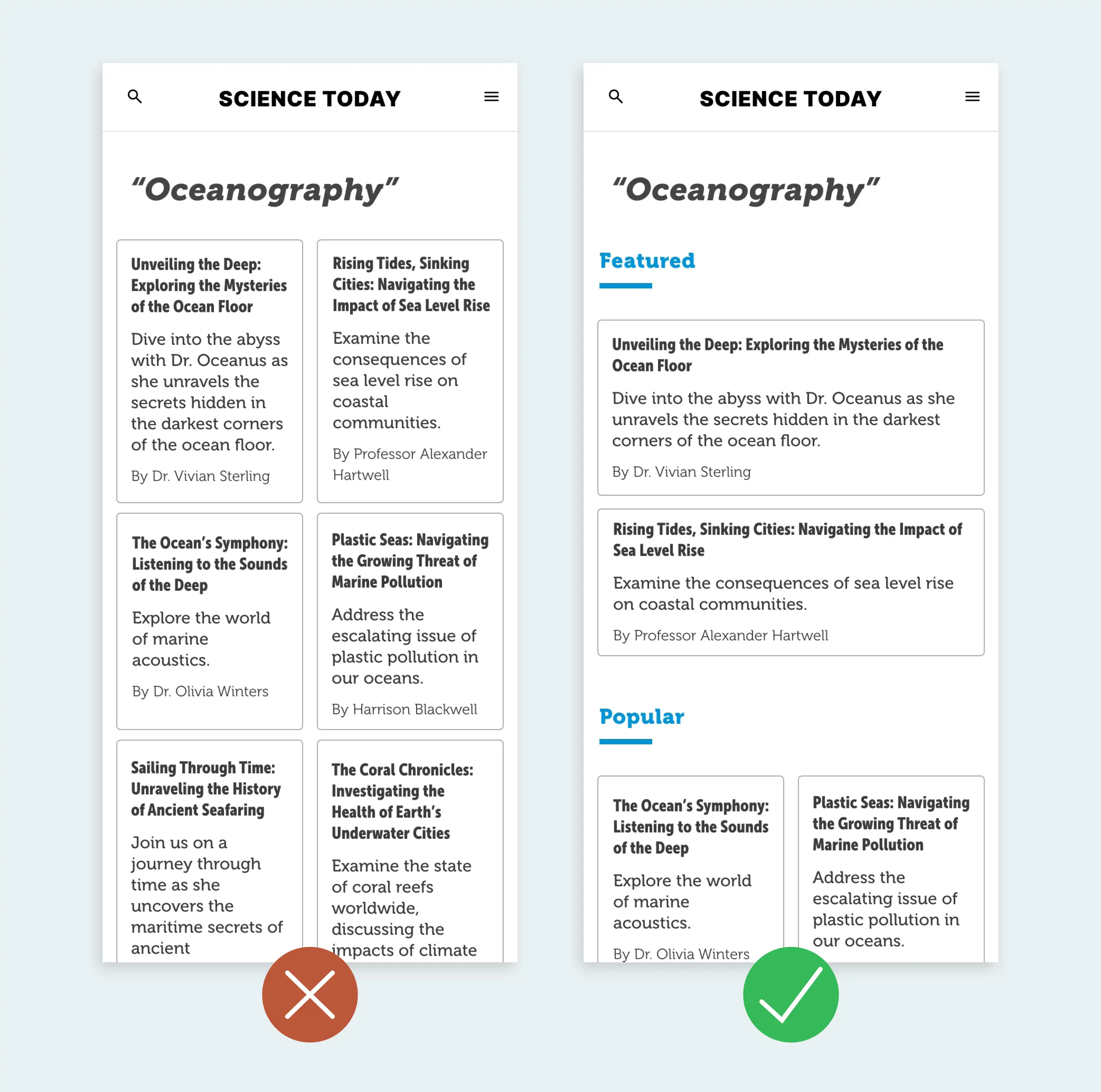
Poor scanability? Use clear iconography.
Effective icons streamline user understanding, reducing the learning curve by enabling quick comprehension without the need for lengthy instructions. On the other hand, unclear icons increase the risk of misinterpreting actions and can cause potential disorientation. Not using icons at all can make content seem overwhelming to navigate.
To enhance user interactions, opt for symbols recognized for their functions. Be aware that the "ideal" icon is much more rare than you might think, so it's important to regularly assess and test icons to ensure user comprehension, making adjustments as necessary for optimal clarity and usability. Accompanying text should still be used whenever possible, although more commonly used icons (such as a search icon) might not need text. Once you’ve settled on icons you’re confident will be understood, use them consistently throughout the interface.
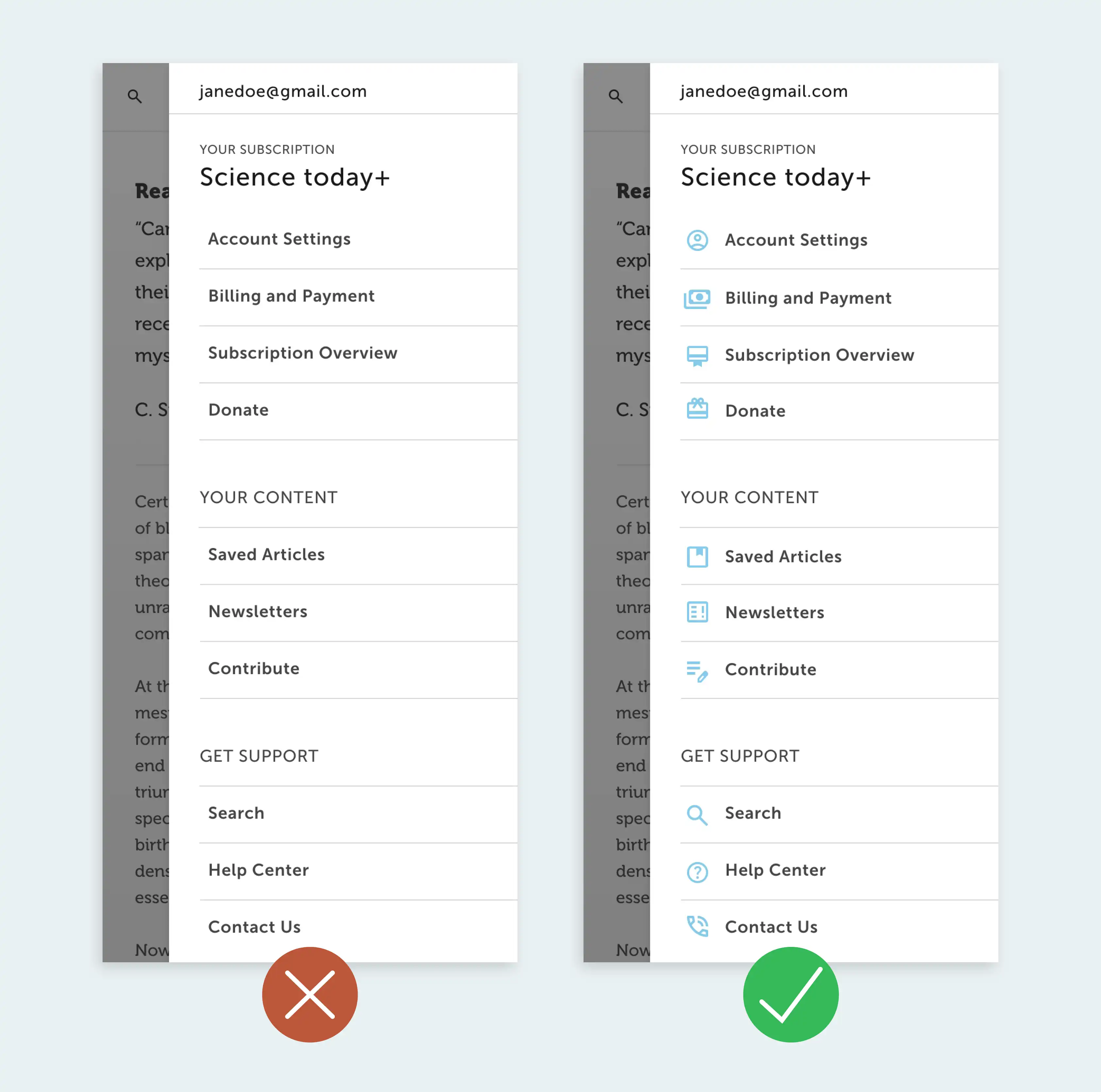
Avoid: Using abstract icons with unclear meaning or not utilizing icons at all. Text is often considered harder to visually scan than images because it requires more cognitive processing.
Best practice: When users are scanning content, universal images can provide immediate context and visual cues, aiding in the rapid identification of key information.
Overwhelming content? Prioritize white space.
In UI design, prioritizing white space (empty space without content) is crucial for visual clarity and user comfort. Crowded interfaces can overwhelm users and impede smooth navigation. If they can’t easily find what they need, users might move on to a competitor that offers a clearer, more navigable experience.
Identify areas that feel crowded, and then establish a clear hierarchy by allocating more white space around essential elements. Consistency is key—maintain a uniform approach to spacing throughout your UI for predictability and order. Mindful grouping of related elements with sufficient white space fosters organization and prevents visual overload.
Avoid: Too much information presented in a limited space.
Best practice: Add more white space to the margins to help users scan within a limited area. If possible, logically group elements of a similar kind together.
Confusing feedback? Craft clear error messaging.
When users encounter errors or issues within an application or website, well-crafted error states can mean the difference between a user having a frustrating interaction or a positive one. Clear and user-friendly error messages not only inform users about the problem but also guide them on how to resolve it.
Craft concise error messages that clearly state the issue and offer specific guidance in plain language. Use visual cues such as icons or color changes for emphasis, ensuring consistency with the overall design. Maintain a supportive tone and provide actionable solutions for users to navigate and resolve the issue. Display error messages prominently yet unintrusively, avoiding disruptions to the user flow while making information easily noticeable.
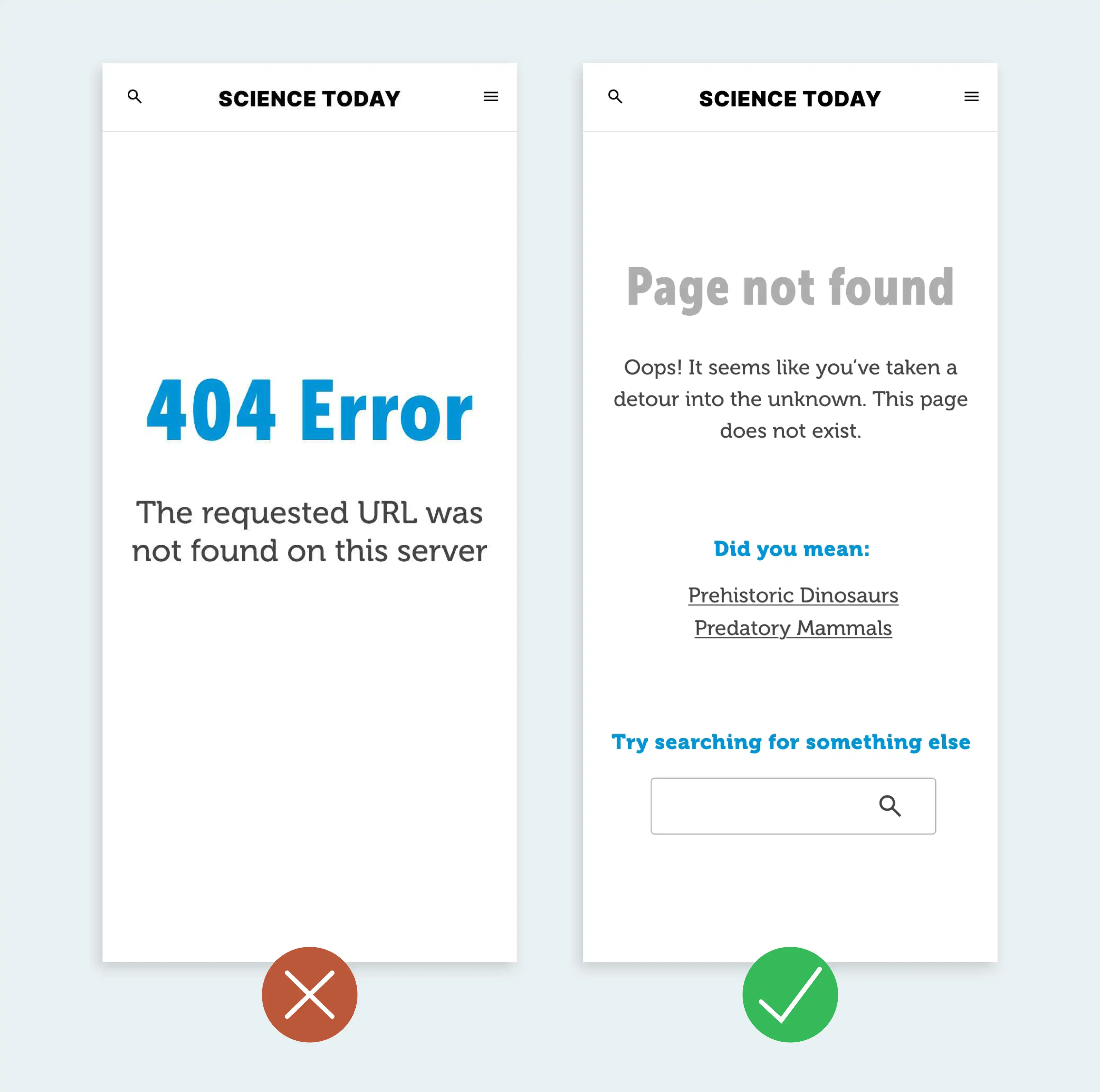
Avoid: Technical jargon that users may not be familiar with.
Best practice: Clearly communicate the problem to the user and provide an explicit path forward.
Lack of inclusivity? Prioritize accessibility for all users.
Prioritizing accessibility is paramount to ensure inclusivity. Neglecting accessibility features can lead to the exclusion of users with specific needs.
To incorporate this principle effectively, advocate for an accessible design by ensuring proper contrast and text sizes. Demonstrate a commitment to a user-friendly experience for everyone by actively considering and implementing features that accommodate diverse user requirements. This may include using accessible color palettes, providing alternative text for images, and ensuring keyboard navigation functionality.
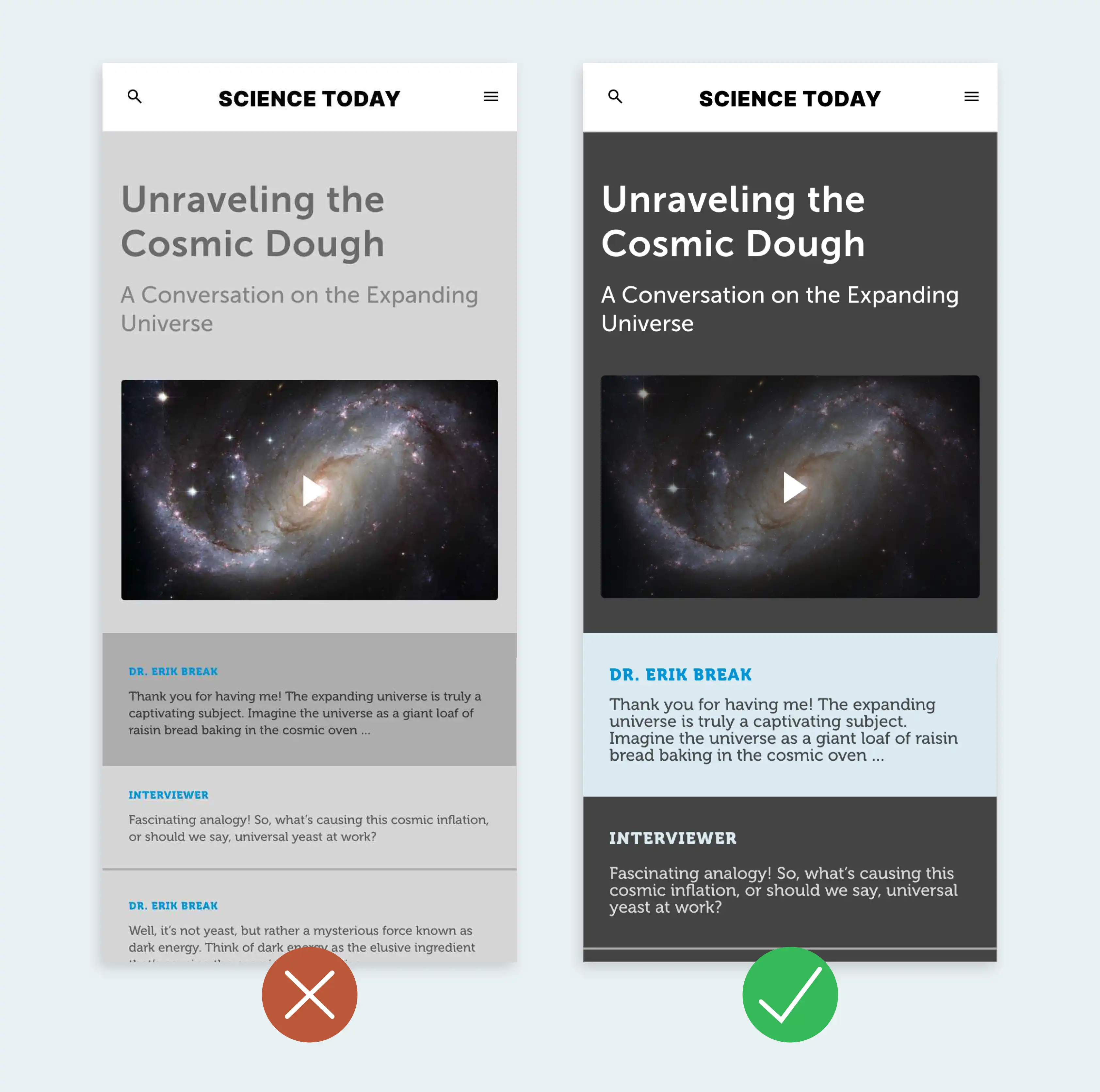
Avoid: Poor contrast and failing to consider how UI elements look in every state.
Best practice: Prioritize accessibility by using automated accessibility testing tools, browser developer tools and user testing.
Elevate your UI for lasting impressions in 2024
We’ve all seen plenty of offenders making these UI mistakes (including ourselves at times!), so if you've made them yourself, don’t lose heart.
By utilizing clear CTAs, text hierarchy, meaningful iconography, use of white space, clear error states, and optimizing for accessibility, your UI will lay a strong foundation for software that prioritizes user experience. Implementing these 6 principles will arm you with some of the keys needed for crafting the “Disneyland” of user experience.


We are custom software experts that solve.
From growth-stage startups to large corporations, our talented team of experts create lasting results for even the toughest business problems by identifying root issues and strategizing practical solutions. We don’t just build—we build the optimal solution.
From growth-stage startups to large corporations, our talented team of experts create lasting results for even the toughest business problems by identifying root issues and strategizing practical solutions. We don’t just build—we build the optimal solution.